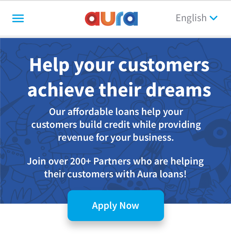
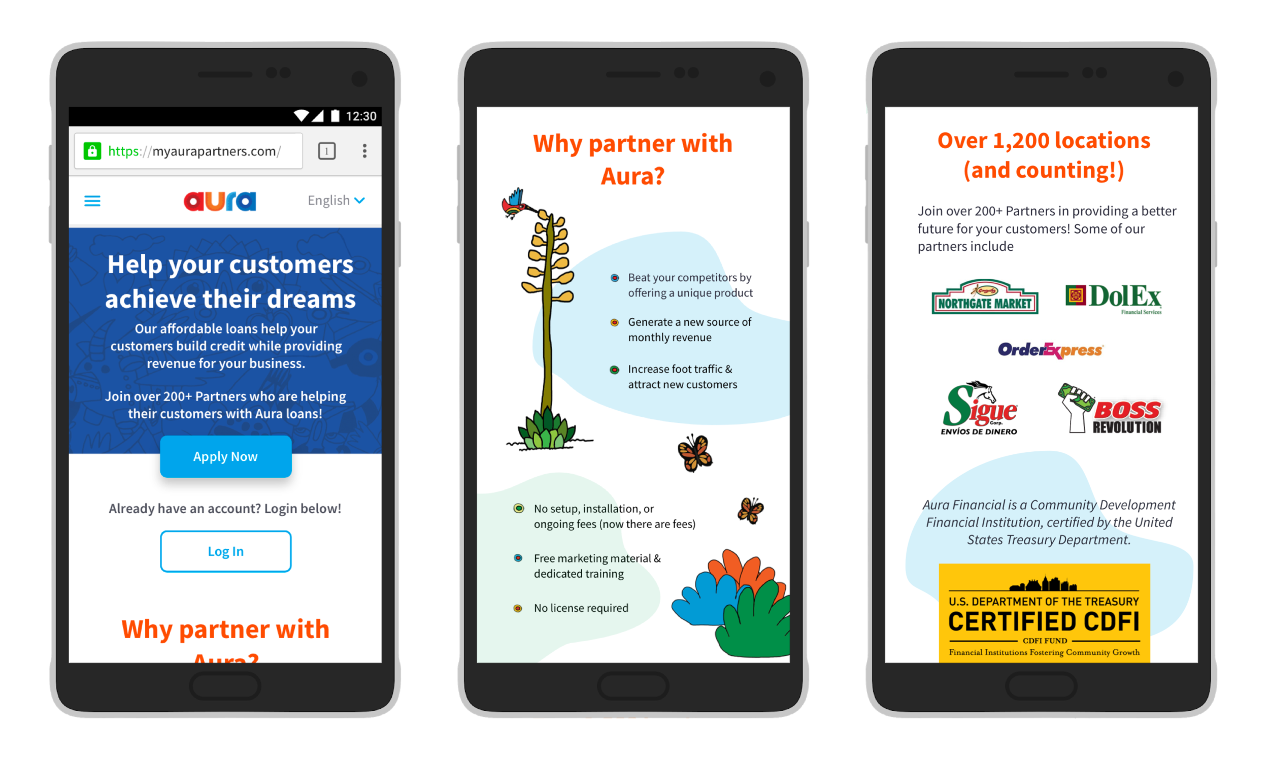
Screenshot of Aura’s partner store application website (mobile view).
ONE CHANCE AT A FIRST IMPRESSION
BUILDING A BETTER PARTNER STORE APPLICATION EXPERIENCE
Aura was a financial technology start-up based in San Francisco, CA that provided an alternative to payday loans by giving access to credit-building personal loans within under-served and under-banked communities. Since Aura was a white-label financial service, we partnered with various financial centers (e.g. Dolex, Prospera, Sigue, etc.) that were already established and trusted in these communities.
Our partner store application website at the time was not easy to use, and did not reflect the level of modernity and trustworthiness that the Aura brand wanted to reflect. As the lead designer on this project, I worked with colleagues to understand the complexity of the application system to create a responsive design that functioned across multiple devices and reflected Aura’s modern branding.
Team & Duration
As the Lead UX Designer, I focused on designing a clean and intuitive interface that was consistent with our consumer-facing style. I collaborated with two of my colleagues: Partner Manager Tania Cardenas Alegre to learn about the application’s logic and constraints for each type of business that applies, and Senior Software Engineer Scott Shillcock who specializes in the website platform called “Bubble” that the application was being built in.
The project was completed within three weeks.
Tools & Methods
User Flows
Wireframing
Usability Testing
Rapid Prototyping
User Interface Design
Interaction Design
the opportunity
How might we design a cleaner, more intuitive application process?
Our design team had limited bandwidth with so many projects, so our online application for prospective partner stores had yet to be updated to Aura’s new branding. The application itself had many variables, including various types of businesses requiring different types of licenses and legal documents for verification. How could we help ease the application experience for our prospective partners? With so many if-then variables to take account of throughout the process, multiple user flows and intuitive interface designs were necessary to flesh out each user’s journey, as well as close collaboration with my software engineer colleague to know what the Bubble website platform was capable of in terms of interaction design.
solution
Design a responsive Aura-branded interface with intuitive micro-interactions
The final design used multiple micro-interactions depending on the selection of each question before, allowing the user to be certain that they were selecting the correct answers for their business. I also designed a responsive interface, where it could be used on mobile, tablet, or desktop, without compromising its usability. This allowed our brand to maintain professionalism and trust in our brand through a consistent and modern look.
STEP ONE: FAMILIARIZATION
What were the constraints of the application? How might we design the flow of questions to be as intuitive as possible?
My first step was to understand how the current partner store application process worked and looked like. Tania did a wonderful job creating a powerpoint deck going through all the nuances of each type of business that might apply, explaining their corresponding legal requirements and documents needed for verification.
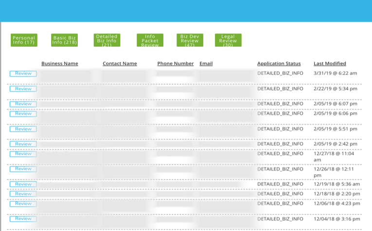
View of partner applications submitted to the Business Development team (contact information is blurred to protect privacy).
Issues that came up in our discussion were:
UI did not look nice, needed to be updated to look like Aura’s branding
Copy was confusing and hard to understand causing multiple applicant errors (missing licenses, wrong business type, etc.)
Difficult to finish in one sitting, applicants would not be able to save progress and drop off due to frustration
Because of these usability issues, our Business Development team would waste a lot of time trying to contact partner applicants to complete their applications and request missing legal documents. Applicants would also get frustrated at the slow process and waiting to hear back from Aura about the status of their application.
After reviewing what needed to be updated, Tania provided the constraints of the project:
Business type selection was extremely important, since the following questions would depend on the applicant’s previous answers - for example, if an applicant chooses “Direct MSB” at the beginning of the application, the “MSB Specific Questions” section would appear later in the application.
The design also needed to be responsive to mobile and tablet views - most applicants are executives who are always on the go and need a mobile view instead of a desktop view.
step two: wireframing + high fidelity mockups
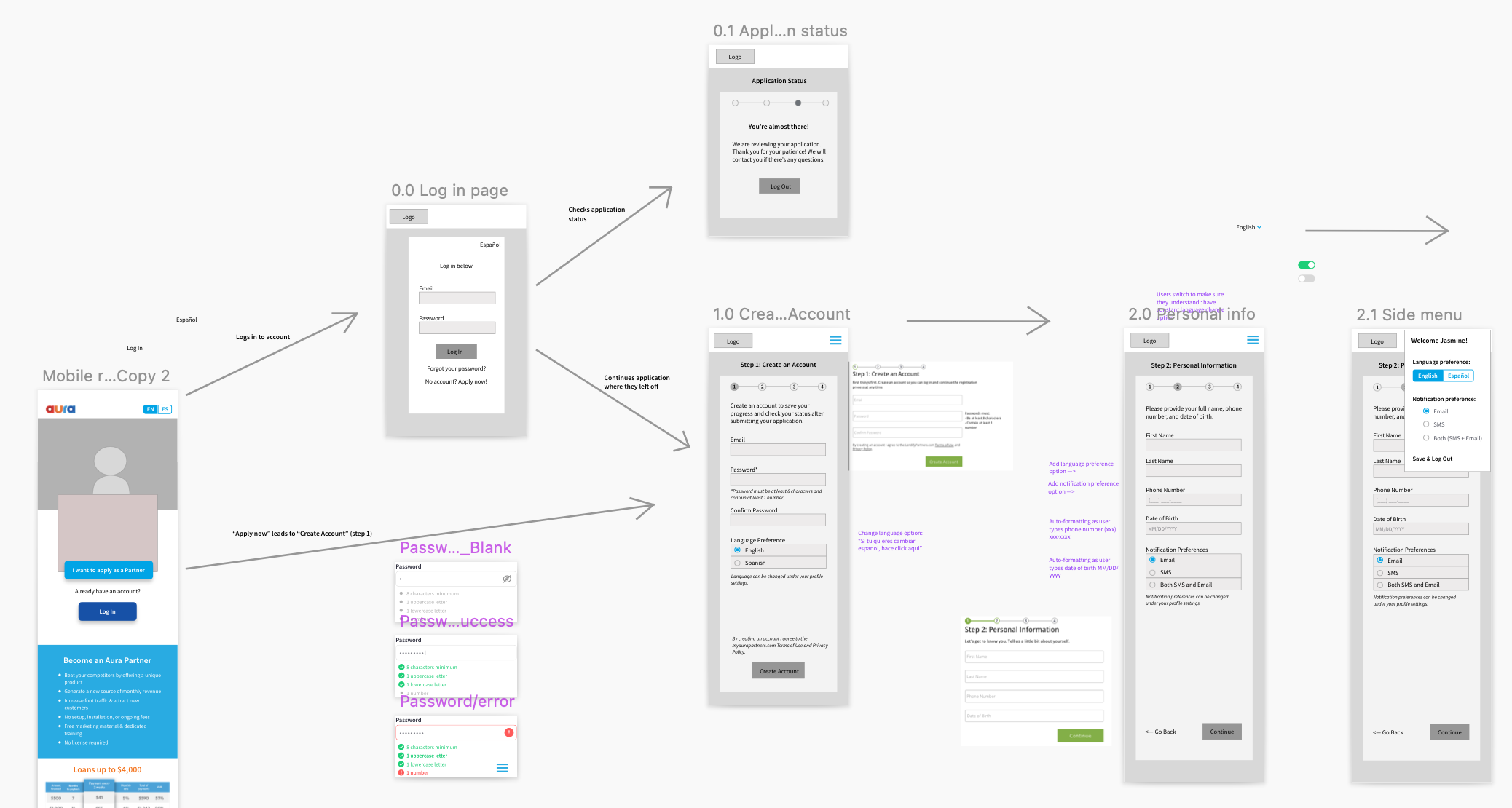
After assessing the needs of the project, I laid out each section of the application and separated questions for each category. It was important to be careful of the details since each question had its own requirements and each subsequent question depended on the previous answer. After discussing with Tania on the format, I designed the application to be a “wizard” format. This way, the applicant could focus only on the section at hand and not be overwhelmed with the amount of questions and information all at once.
Screenshot of Sketch workspace with multiple wireframes of partner application.
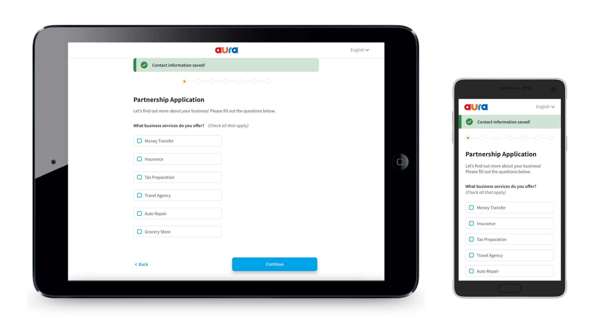
After wireframing, I designed the high fidelity versions and created an InVision prototype for Scott, our engineer. He and I met frequently to make sure the designs were in line with the Bubble platform’s website capabilities, to describe the design’s microinteractions, and to make sure the designs were responsive across mobile and tablet devices.
Tablet and mobile devices showing the responsive design of the partner application website.
step three: landing page mockup
Lastly was Aura’s landing page for the partner application website. We wanted the landing page to inspire trust and legitimacy for potential partners, while maintaining the overall branding and feel of the consumer-facing website. By analyzing the mobile versions of competitors’ websites, I was able to distill important elements such as:
Benefits of an Aura partnership
Logos of trusted brands that we’ve partnered with
Certifications that Aura has and links to read more about them
(From left to right) Mobile view scrolling screenshots of the partner application website’s landing page.
results
The final product was an Aura-branded partner application website that represented Aura’s values of integrity, trust, and legitimacy. Thanks to the wizard format of the application and its clean interface, applicants could now focus on each question independently and save their progress if they needed a pause.
As a first impression for potential partners, it was important that our Business Development team felt confident in using a modern and functional website that they could use to pitch to clients in stores. Now with its responsive design, my colleagues could just bring their tablets or mobile devices out on the field and there would be no design issues when loading the website. Our Business Development team could also use their tablet to check current applications while our of the office and contact applicants in a timely manner, saving any leads and maintaining brand trust.
retrospective + next steps
With this project, I would have liked to have more time. As it usually is in startup environments, we were strapped for time and resources to get this website live. However, I would have liked to spend more time on the landing page design, considering there are some elements that were left out for simplicity’s sake.

